Doug Evans spent 1,200 days in San Francisco building a juicer. Twelve prototypes. Custom-milled aluminum. Wi-Fi connectivity. An app that logged your vegetable intake. Four tons of pressing force, enough, Evans told reporters, to lift two Teslas off the ground. The machine cost $699 and occupied kitchen counters like sculpture: clean lines, brushed metal, the heft of a thing that meant business. Google Ventures invested. Kleiner Perkins invested. $120 million flowed in from backers who held the device, admired its weight, and saw the future of food.
On April 19, 2017, Bloomberg published a video. A reporter squeezed one of Juicero’s proprietary fruit packs with her bare hands. Juice poured into a glass. Same quantity. Same speed. Sometimes faster than the machine.
The $120 million press was unnecessary. The bag already contained juice. The four tons of force, the custom motors, the Wi-Fi handshake that verified a QR code before permitting you to drink, all of it dressed up a function that two human palms performed for free.
Juicero suspended sales five months later. The company collapsed into shorthand for everything wrong with Silicon Valley: a gorgeous machine that solved a problem nobody had, funded by people who confused the look of innovation with the fact of it.
The Why
The bias predates the term. In 1995, researchers Masaaki Kurosu and Kaori Kashimura at the Hitachi Design Center in Tokyo tested 26 variations of an ATM interface. They asked 252 participants to rate each design on ease of use and aesthetic appeal. Participants rated beautiful interfaces as more functional, regardless of whether those interfaces functioned well. The distance between perceived usability and actual usability tracked aesthetic appeal almost perfectly. Kurosu and Kashimura concluded that users could not separate how something looked from how they believed it performed, even when instructed to try.
In 2018, Kerstin Haring and her colleagues at the United States Air Force Academy named the phenomenon. Their paper in IEEE Transactions on Cognitive and Developmental Systems introduced the Form-Function Attribution Bias: the cognitive shortcut where people assess capability based on appearance. Their research focused on robots. A humanoid robot drew assumptions of social intelligence. An industrial-looking robot drew assumptions of physical strength. The expectations bore no relationship to actual engineering. People saw the form and filled gaps in knowledge with guesses drawn from what they could see.
When Apple released the first iPod in October 2001, reviewers handled its white polycarbonate casing and scroll wheel and called it revolutionary. Creative Labs had shipped the Nomad Jukebox a year earlier with more storage capacity and a lower price. The Nomad looked like a portable CD player. The iPod looked like the future. By October 2004, Apple held over 90% of the hard-drive-based music player market in the United States. The Nomad carried more function. The iPod carried more form. Form won.
For creatives, the Form-Function Attribution Bias cuts both directions. You fall for it when evaluating tools, platforms, collaborators, and competitors. Your audience falls for it when evaluating your work. The photographer who prints her portfolio on heavy cotton stock gains perceived competence she may or may not deserve. The songwriter who records in a professional studio gets credited with talent the lo-fi bedroom artist does not, even when the songs carry identical craft.
The How
Form-Function Attribution Bias responds to intervention at four points. Each targets the moment between perception and judgment, the fraction of a second when appearance becomes verdict.
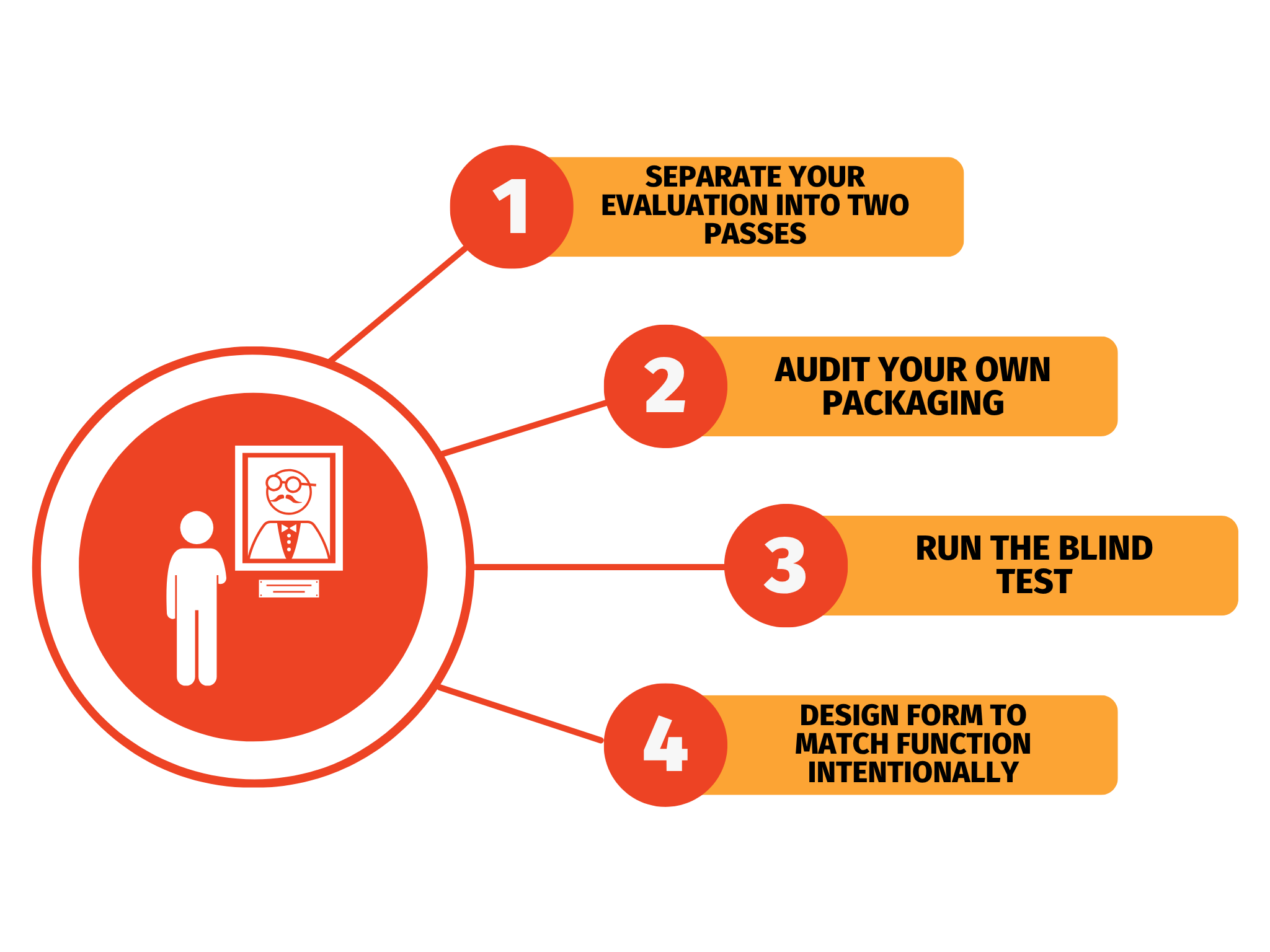
- Separate your evaluation into two passes. When you encounter a new tool, a potential collaborator’s portfolio, or a competitor’s product, force yourself to evaluate form and function independently. First pass: examine the packaging and the presentation. Write down your first impression. Second pass: test the function. Use the tool. Read the manuscript. Listen with your eyes closed. Compare your two-pass notes. The distance between impression and evidence measures exactly how much the bias costs you.
- Audit your own packaging. Inventory every touchpoint between your work and your audience. Your website. Your business cards. Your portfolio format. Your email signature. Your file names. Rate each on a scale of form quality, then rate the work behind it on a scale of function quality. Where form outpaces function, you are borrowing credibility you have not earned, and the loan comes due on delivery. Where function outpaces form, you are hiding your best work behind a facade that signals mediocrity.
- Run the blind test. Strip the form from any decision that matters. When hiring a designer, request work samples without names or studio branding. When selecting your own best photograph, convert everything to identical sizing, identical framing, identical file format. When evaluating your draft, paste it into a plain text editor and read it without the formatting you spent an hour perfecting. Major American orchestras stumbled onto this principle in the 1970s when they placed screens between audition panels and musicians. Economists Claudia Goldin and Cecilia Rouse documented the results in a 2000 study: blind auditions increased the probability of female musicians advancing by 50% in preliminary rounds. The screen stripped form from function, and the function that emerged looked different from what the judges expected.
- Design form to match function intentionally. Once you have verified function, calibrate your form to communicate it accurately. A well-crafted novel deserves a professionally designed cover, because the cover is a promise, and the pages fulfill it. A half-finished prototype deserves rough presentation, because polish at the prototype stage invites the Form-Function Attribution Bias from stakeholders who will confuse shine with readiness. Match the signal to the state. The space between form and function always closes. You choose whether it closes on your terms or on your audience’s.
Exercise: Choose a piece of your own finished work and present it to two separate people in two different formats. Person A receives it with your best packaging: designed PDF, professional header, clean layout. Person B receives it as plain text in an email body, no formatting, no branding. Ask both to rate the quality of the work itself on a scale of 1 to 10. Record the difference. That number measures how much of your perceived value lives in the form rather than the function. Fifteen minutes of preparation, two conversations. You finish with a data point most creatives never see.
Tips and Tricks
- Prototype ugly on purpose. When testing ideas with collaborators or clients, use rough sketches, plain documents, and stripped-down mockups. Polished prototypes trigger the bias in your testers, who then critique aesthetics instead of substance. Ugly prototypes force attention toward the idea.
- Photograph your workspace before a client visit. Clients who walk into a cluttered studio unconsciously downgrade their assessment of your capabilities. A clean workspace is form for the function of your talent. This changes what they pay and what they forgive.
- Use the plain text test before sending any pitch. Paste your pitch into a plain text editor. If the argument collapses without the formatting, the formatting was doing work your words should do. Formatting amplifies a strong argument. It cannot rescue a weak one.
- Study what your competitors package well. Find the competitor whose work falls below yours but whose presentation rises above it. Reverse-engineer their form. The distance between your function and their audience’s perception tells you where to invest.
Mistakes to Avoid
- Investing in form before function is ready. A beautifully designed portfolio website full of mediocre work accelerates your exposure to the wrong verdict. Your audience expects the function to match the form. When it fails to deliver, the disappointment compounds, because the promise was louder. Launch form when function can support the weight.
- Dismissing work because its form is poor. The bias operates in reverse with equal force. A brilliant collaborator with an ugly website gets passed over. A transformative book with an amateur cover stays on the shelf. A demo recording with room hiss gets skipped. Train yourself to notice when you are penalizing function for the sins of form.
- Assuming your audience is immune. Kurosu and Kashimura’s participants at Hitachi were told to evaluate usability. They tried. They still rated beautiful interfaces as more functional than ugly ones. Expertise does not dissolve the bias. Your audience, who evaluates work with far less training, falls harder and faster. Engineering around the bias changes outcomes. Awareness alone does not.
- Polishing at the wrong stage of the creative process. Making a rough draft look beautiful before the structural edit triggers the bias in your own brain. You grow reluctant to cut polished prose, reorganize formatted sections, delete pages you spent hours designing. Ugly work is easier to kill. Keep your drafts ugly until the last possible revision.
- Ignoring the form of your competitors. You may possess superior function and still lose the client. If your competitor’s form outperforms yours, the bias delivers their audience a perception of quality they have not earned and withholds from you a perception you have. Track form quality across your competition. Treat it as a variable you control, because you do.
The Surface Audit
The bias works on your audience in every interaction with your creative output. The following audit maps where form is carrying you and where it is costing you.
- List every touchpoint your audience encounters. Website homepage. Social media profile. Email newsletter template. Business card. Portfolio PDF. Packaging. Invoice format. Thank-you page after purchase. Every point of contact carries form information that triggers assumptions about your function.
- Rate each touchpoint on a 1 to 5 scale for form quality. Five means polished, cohesive, professional. One means outdated, inconsistent, visually weak. Ask someone outside your field to rate them too, because your proximity to your own work distorts your judgment.
- Rate the work behind each touchpoint on the same scale for function quality. Five means your best creative output. One means something you have outgrown or that no longer represents your capabilities.
- Identify the mismatches. Touchpoints where form scores higher than function are credibility loans. Touchpoints where function scores higher than form are missed revenue. Touchpoints where both scores match are calibrated correctly.
- Fix the largest mismatch first. Upgrading your lowest-form, highest-function touchpoint gives you the best return on investment. You already have the goods. You need packaging that stops disguising them.
- Set a review schedule. Form degrades with time. Design trends shift. Templates age. What read as professional two years ago reads as dated today. Audit every six months. Your function evolves. Your form should track it.
- Test with strangers, not friends. Friends see your function through prior knowledge. Strangers encounter your form cold, the way your actual audience does. A stranger’s five-second reaction to your website tells you more about your Form-Function Attribution Bias exposure than a friend’s detailed critique ever will.
Kurosu and Kashimura found something else in their 1995 data: the bias hit hardest during the first encounter. Initial impressions set the baseline that subsequent experience had to overcome. Every touchpoint a stranger reaches for the first time is an ATM interface in a Hitachi lab, and the evaluation has already fired before a single function runs.
When Ugly Wins
The bias has a blind spot.
Craigslist generated $694 million in revenue in 2023 with roughly 50 employees. The site looks like it was designed in 1996, because it was. No images on the homepage. No color palette. No brand identity beyond a list of blue hyperlinks arranged by city. Every design principle the modern web industry preaches, Craigslist ignores. Every year, competitors launch with gorgeous interfaces and aggressive funding. Every year, Craigslist outlasts them.
Wikipedia followed a parallel trajectory. The encyclopedia that replaced Britannica runs on a design so sparse it borders on hostile. No hero images. No animations. No branded experience. The platform became one of the ten most visited websites on earth while looking like a graduate student’s research page.
The paradox resolves through the lens of Form-Function Attribution Bias. In certain contexts, rough form signals something polished form cannot: authenticity. A classified ads site with no design budget tells users their money goes toward the transaction, not the scenery. An encyclopedia with no visual ambition tells readers the editors spent their energy on accuracy, not aesthetics. The absence of form becomes a form of its own, one that communicates a specific function: we prioritize substance.
Punk zines operated this way. Photocopied, hand-stapled, typos left uncorrected. The ugliness was the credential. It signaled that the writer cared more about the content than about impressing you. Lo-fi recordings carry the same signal. The tape hiss and room tone tell listeners the musician chose the performance over the production. The roughness communicates intimacy, a proximity between artist and audience that polished production would destroy.
The strategic question for creatives: polished form wins in commercial contexts where trust and professionalism drive purchase decisions. Rough form wins where authenticity and rawness drive connection. A literary journal with a minimalist, undesigned cover signals seriousness. A marketing agency with the same aesthetic signals incompetence. Same form. Different function attributed. The context decides.
The bias is a lens, and every lens distorts. The distortion works in your favor only when you know which direction it bends.
Juicero collapsed because the distortion ran in one direction for too long. Investors looked at Evans’s machine and saw a future the machine could not deliver. Consumers looked at it and saw capability that bare hands already possessed. The form was flawless. The function was a bag of pre-pressed vegetables.
Evans spent 1,200 days perfecting a surface. A Bloomberg reporter spent ninety seconds looking past it. The gap between those two timelines is the distance between what form promises and what function delivers. Every creative project lives in that gap. The ones that survive are the ones where the function was ready when the audience finally looked past the aluminum.